
5 common mistakes in hanging wall art
Hanging too high
When styling a space, the placement of artwork is just as important as the piece itself. When artwork is hung too high on the wall, it tends to feel disconnected from the furniture and the overall room setting. The eye has to travel awkwardly upward, breaking the natural line of sight. This can make the space feel disjointed, less inviting, and even empty in the area between the furniture and the art.
2. Hanging too low

If artwork is too close to the back of a sofa or the top of a console, it can feel cramped and squeezed into the space rather than thoughtfully placed.
Low-hung pieces visually “pull down” the room and disrupt the balance between wall, furniture, and art. This can make ceilings feel lower and the room look smaller.
Optimal Height

A general rule of thumb is to create a visual connection between the artwork and the furniture below it, so that the overall arrangement feels intentional and cohesive.
Above a sofa: The ideal height is about 30–40 cm above the backrest. This ensures that the artwork relates visually to the sofa rather than floating too far above it, creating a balanced composition.
Above a console table: The recommended distance is slightly less, around 20–30 cm above the surface. Because consoles are usually narrower and taller than sofas, placing the artwork closer keeps the grouping harmonious and well-grounded.
As a general rule, keep it at eye level, 155-165 cm from floor to centre of artwork.
3. Not proportionate to wall

Hanging wall art that is too small for the wall creates a sense of imbalance and makes the space feel empty or unfinished. The artwork can appear lost against a large expanse, failing to draw attention or create the intended visual impact. Instead of enhancing the wall, it emphasizes the blank space around it, making the room look less cohesive.
Optimal size
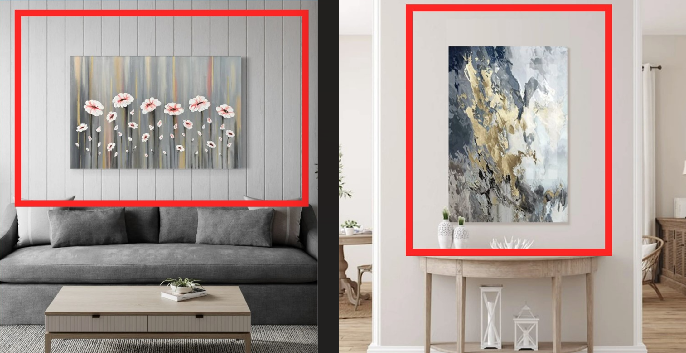
Proportion plays a key role in design, and art that doesn’t match the scale of the wall disrupts harmony. Ideally, artwork should cover about 60–75% of the available wall space to create balance and presence. Choosing larger pieces or arranging multiple artworks together ensures the wall feels intentional, polished, and visually engaging.
4. Not proportionate to furniture
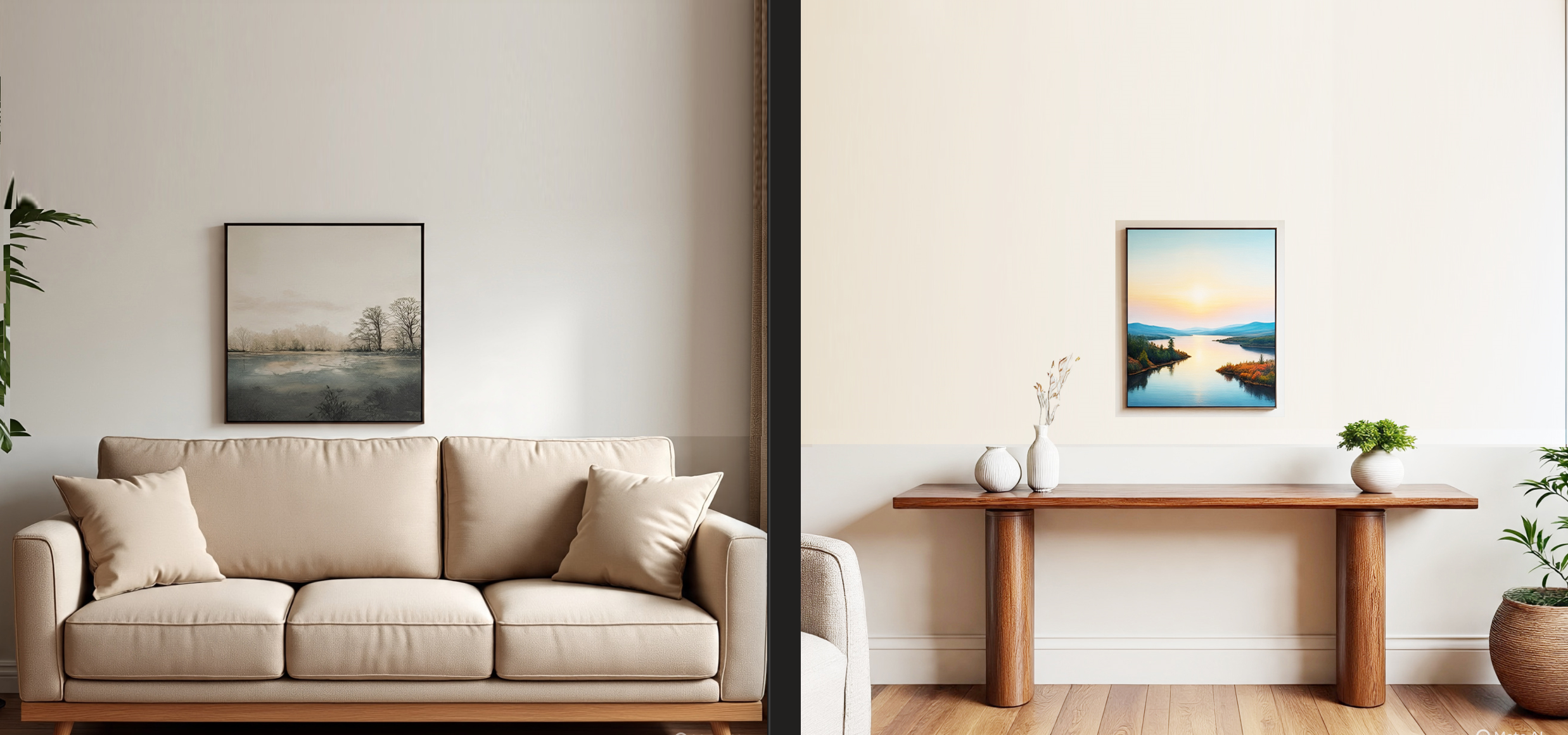
Hanging wall art that is too small compared to the furniture beneath it creates visual imbalance and makes the space feel awkward or unfinished. The piece looks “lost” on the wall, fails to anchor the furniture, and does not provide the intended focal point. Empty space around the artwork emphasizes the disproportion, diminishing the overall impact.
Optimal size

Properly scaled art enhances harmony and balance in a room, tying furniture and wall space together cohesively. A good guideline is to choose artwork (or a grouping) that measures about two-thirds the width of the furniture below, ensuring the wall feels complete and visually appealing.
5. Wrong spacing between multiple artworks

Wrong spacing between multiple artworks can make a wall look cluttered, disorganized, or unfinished. If pieces are placed too far apart, they lose their connection and can feel like isolated items instead of a cohesive display. On the other hand, if they’re too close together, the arrangement may appear cramped, overwhelming, or visually heavy.
Optimal Spacing

Proper spacing is key to creating rhythm, balance, and harmony on the wall. Consistent gaps—generally around 2–5 inches apart depending on artwork size—help the pieces relate to each other while still allowing enough breathing room. This thoughtful spacing transforms a group of artworks into a unified, intentional gallery that enhances the overall aesthetics of the space.